

As the digital links that enable countless disparate applications to communicate with each other, APIs are the glue holding much of our connected world together. But just building an API doesn’t get the job done. For them to work, people have to use them. Otherwise, where’s the value?
Many companies have invested time, money, and resources developing APIs that either won’t be used, or will only be used by a single application. That’s not enough to provide the API business value they were counting on. And the sad news it that they are not even measuring to know it.
As a leader in API management platform solutions, Axway wanted a clearer understanding of the gap between API development and API consumption – why it exists and what can be done to close it.
The 2022 Axway API Adoption Survey, a study conducted by Forrester Consulting and commissioned by Axway, asked more than 300 IT and business decision-makers where their companies stand on closing the API development/consumption gap. The findings were eye-opening.
Companies recognize APIs are key to reaching business goals
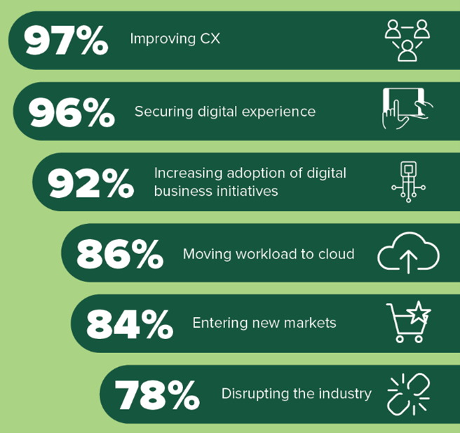
More than three quarters of survey respondents are prioritizing API initiatives over the next 12 months. Improving customer experience (97%), ensuring security (96%), and moving to the cloud (86%) are high on the list of priorities according to the study. Others don’t rank far behind:
Regardless, it doesn’t matter how many APIs a company builds in determining which API initiatives are successful. What matters is how many of their APIs are adopted and used. This overarching reality is not lost on survey respondents.
Decision-makers know API value is driven by API consumption
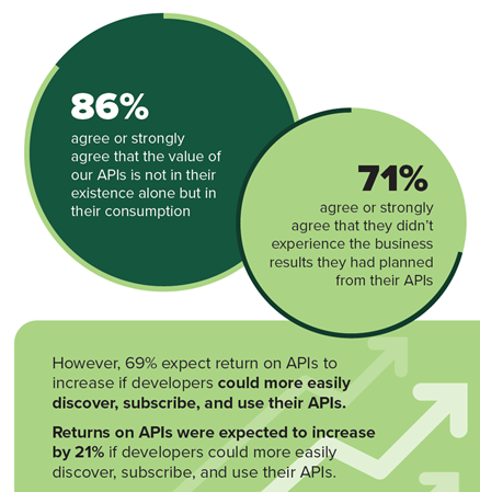
Currently, the majority of companies surveyed have published at least 100 APIs and an overwhelming majority – 86% – recognize the value of their APIs is not in their existence alone, but in their consumption.
Yet, a substantial 71% agree or strongly agree that they didn’t experience the business results they had hoped for with their APIs. And nearly all of them know why: 69% expect return on APIs to increase – by 21% – if developers could more easily discover, subscribe, or use their APIs.
In other words, higher API ROI hinges on higher API consumption.
So why aren’t their APIs being consumed? What’s the holdup?
Overcoming obstacles to business growth means closing the API value gap
The study shows that closing the gap between API development and API consumption is critical to reaching digital business growth. But there are obstacles.
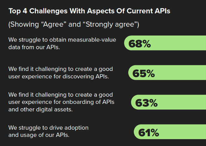
For example, 68% of those surveyed struggle to get API performance metrics – and related insight (I’ll come back to this) – from their APIs. A similar percentage have trouble creating a good user experience for onboarding APIs and discovering them.
By far, the consensus believes these challenges can be addressed with greater API adoption. Indeed, 72% of decision-makers expect digital business growth to increase if they could increase API adoption today. The study shows that 61% percent are having a hard time doing that. But it also suggests a good reason why.
Insight into API performance and usage is lacking
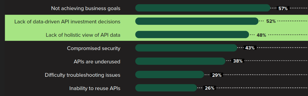
Respondents say difficulty in obtaining insightful data about APIs lead to a lack of data-driven API investment decisions (52%) and a lack of a holistic view of API data (48%). Other consequences include an underuse of APIs and an inability to reuse them. Compromised security (43%) is also high on the list.
Without measurable, actionable data, companies simply don’t have a clear picture of which APIs are being consumed, which ones add value, which ones warrant continued investment, and which ones should be taken out of circulation.
So, it logically follows that any attempt to close the gap between API development and API consumption must include a strategy for gathering and analyzing accurate data on API performance and usage. But it’s not necessarily the only thing, as the next two sections show.
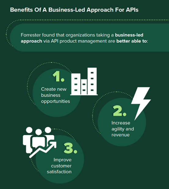
A business-led approach to API strategy can increase API consumption
APIs should be viewed not solely as interfaces into IT systems, but also as interfaces into business capability. Therefore, it makes sense for companies to take a business-led approach to API design, testing, management, and analysis to gain the high-level business results made possible by greater API consumption.
Vendor expertise and API management technology bring API value
60% of API decision-makers say that business and digital expertise is valuable to developing more consumable APIs. 58% find the same value in centralized API tracking and governance available with today’s API management products.
Among the 5 major benefits of an API management product that closes the gap between API development and consumption, 59% of survey respondents believe increased revenue is the top benefit.
Are you ready to get your API program back on track?
Download the report and see how your API consumption priorities align with those of other IT and business decision-makers around the globe.