

Amplify Fusion is Axway’s hybrid solution for providing no-code integrations for data, applications, events, and APIs – both in-cloud and on-premises. It provides out-of-the-box connectors with visual mapping to empower users to rapidly design, test, and deploy business processes anywhere.
You can view the technical on-line documentation for Amplify Fusion here and you can register for a free Introduction to Amplify Fusion on-line course at Axway University here.
In this blog post, we’ll look at how to get started with Amplify Fusion and build our first integration. The integration will simply log a Hello World message. This is the first in a series of “Getting Started with Amplify Fusion” blog posts to help you get up to speed designing integrations.
In order to follow this blog post, you will need access to Amplify Fusion.
See also: Event-based integration made simple — without getting rid of legacy IT
Launch Designer
Once you log into Amplify Fusion you will see the dashboard which shows the three main modules of Amplify Fusion: Designer, Monitor and Manager and the Timeline where you can see activity in your tenant.
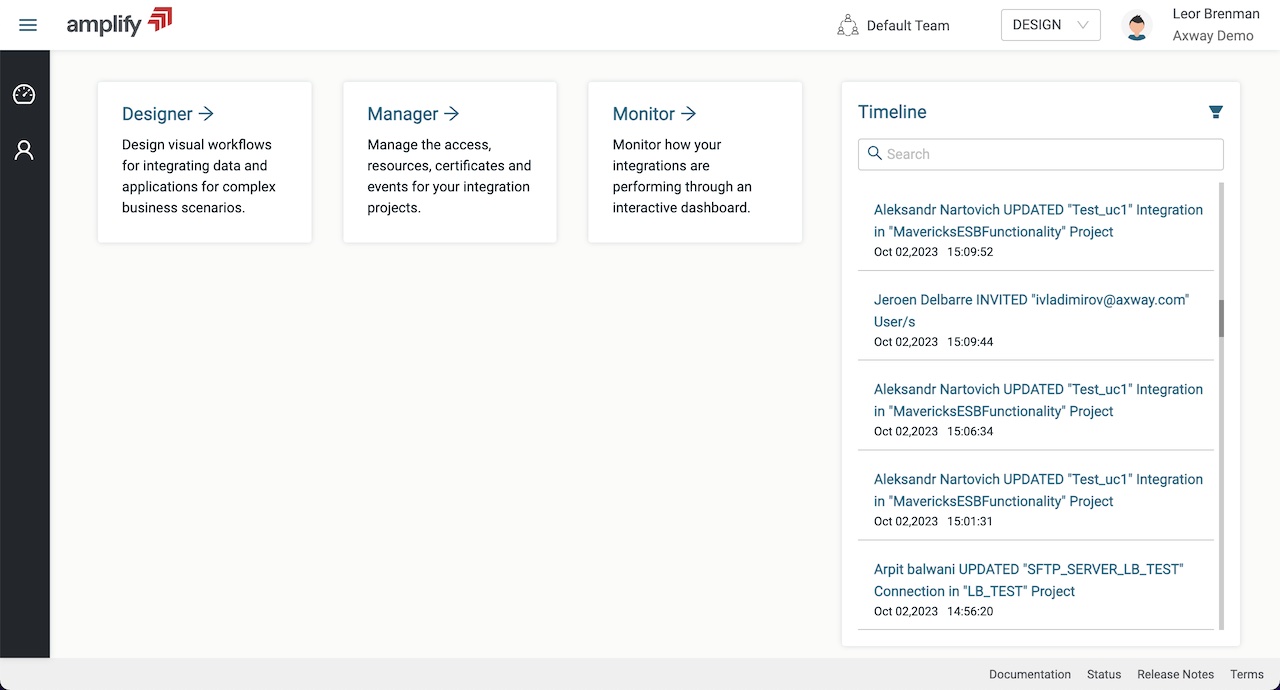
The Manager module is for managing users, deployments and environments and the Monitor module is for viewing integration transactions. We’ll look at these modules in more detail in future posts but for now, click on Designer to enter the Designer module where developers spend most of their time creating integrations and related assets.
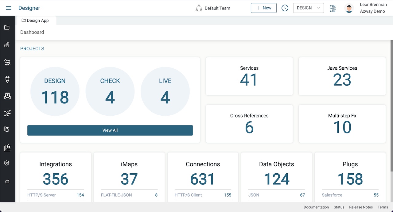
The screen shot above shows the Designer module Dashboard which is a high level overview of all your assets. Yours will most likely be empty. But not for long.
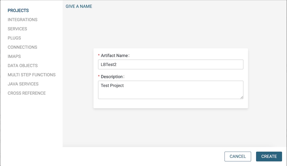
Create New Project
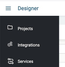
Click on Projects in the menu on the left to enter the projects view.
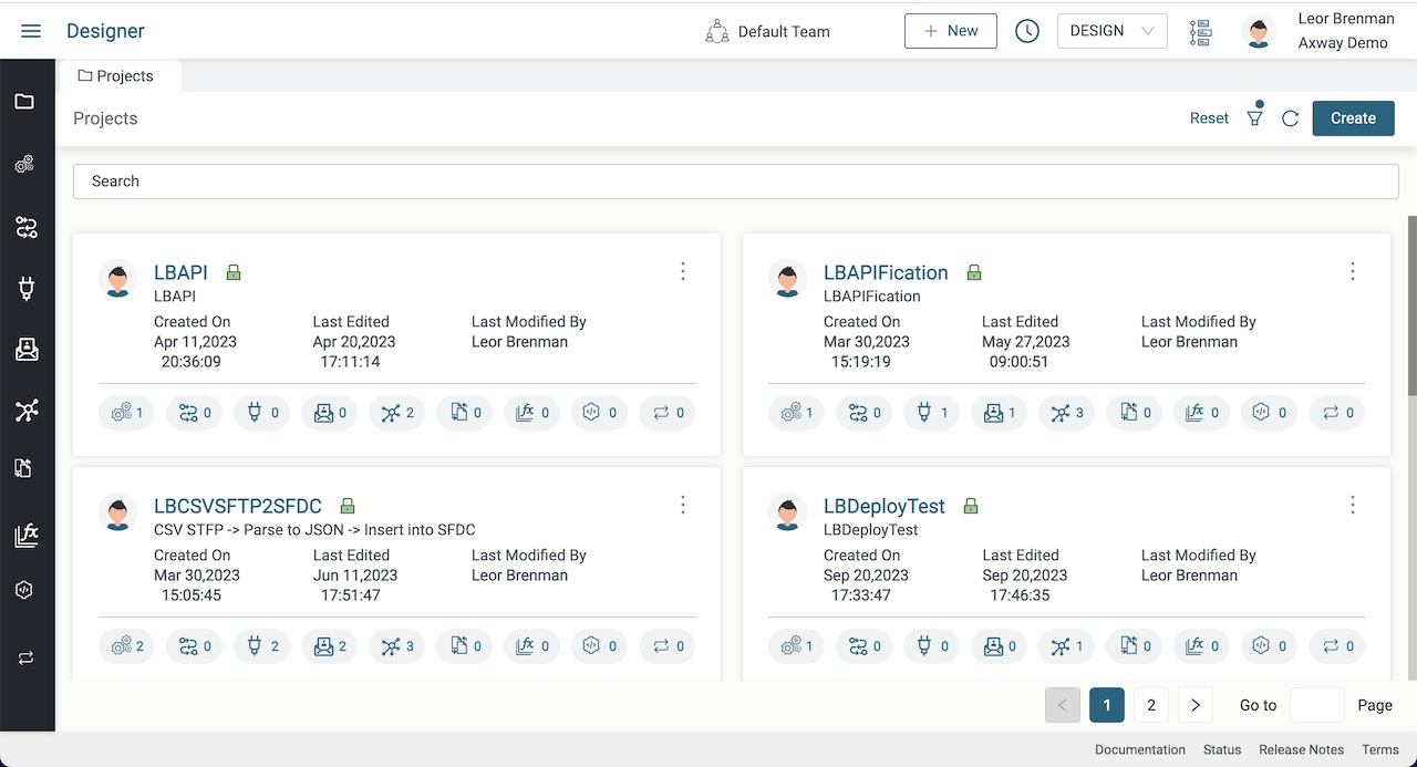
Click on the Create button to create our first project. Give it a name and description and click CREATE.
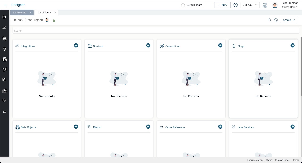
As shown above, a project is a collection of assets such as Integrations, Services, Connections, Plugs, Data Objects and more. We’ll cover these in future posts but for now we’ll focus on the main component, an Integration.
We can use this same project for all the blog posts in this series to make it easier to find assets from one blog post to the next as they will often build on each other.
Create an Integration
Integrations are workflows or processes that can be triggered, scheduled, or event-driven. An integration connects one or more applications to automate a workflow, synchronize data, or transfer data from one application to another.
An integration is the core component of Amplify Fusion. The whole business logic is defined and configured in the integration workflow. An integration workflow starts with an event component that acts as a trigger to invoke the integration.
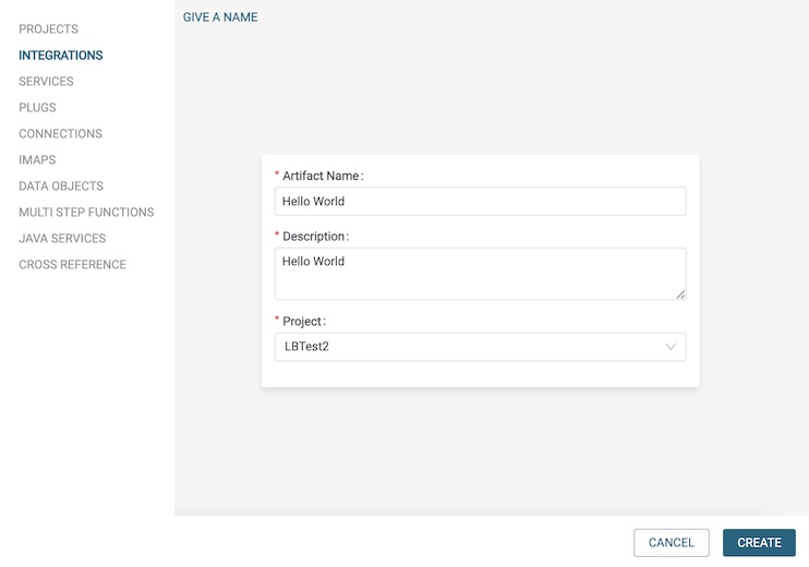
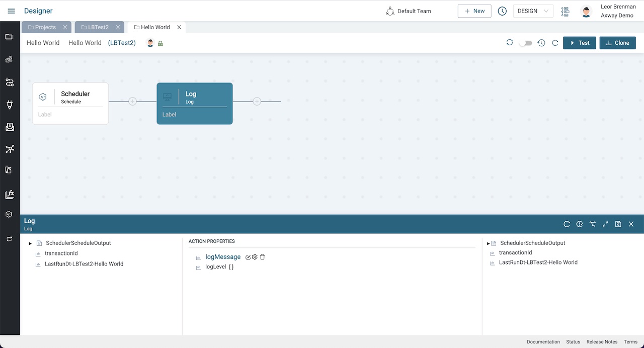
Click the plus icon in the Integrations tile to create an Integration. Give it a name and description and click the CREATE button. This will open the design canvas for your integration where you can design your integration without code.
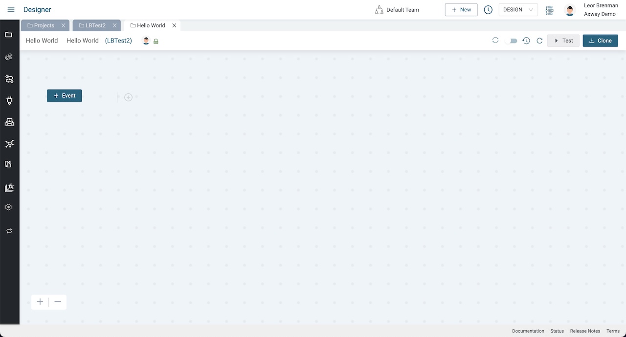
Integrations are designed from left to right. There are magnification buttons in the lower left hand corner to aid in your design.
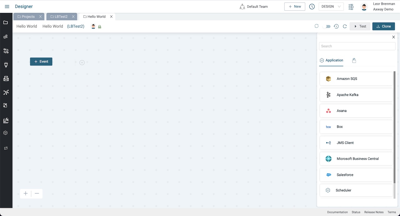
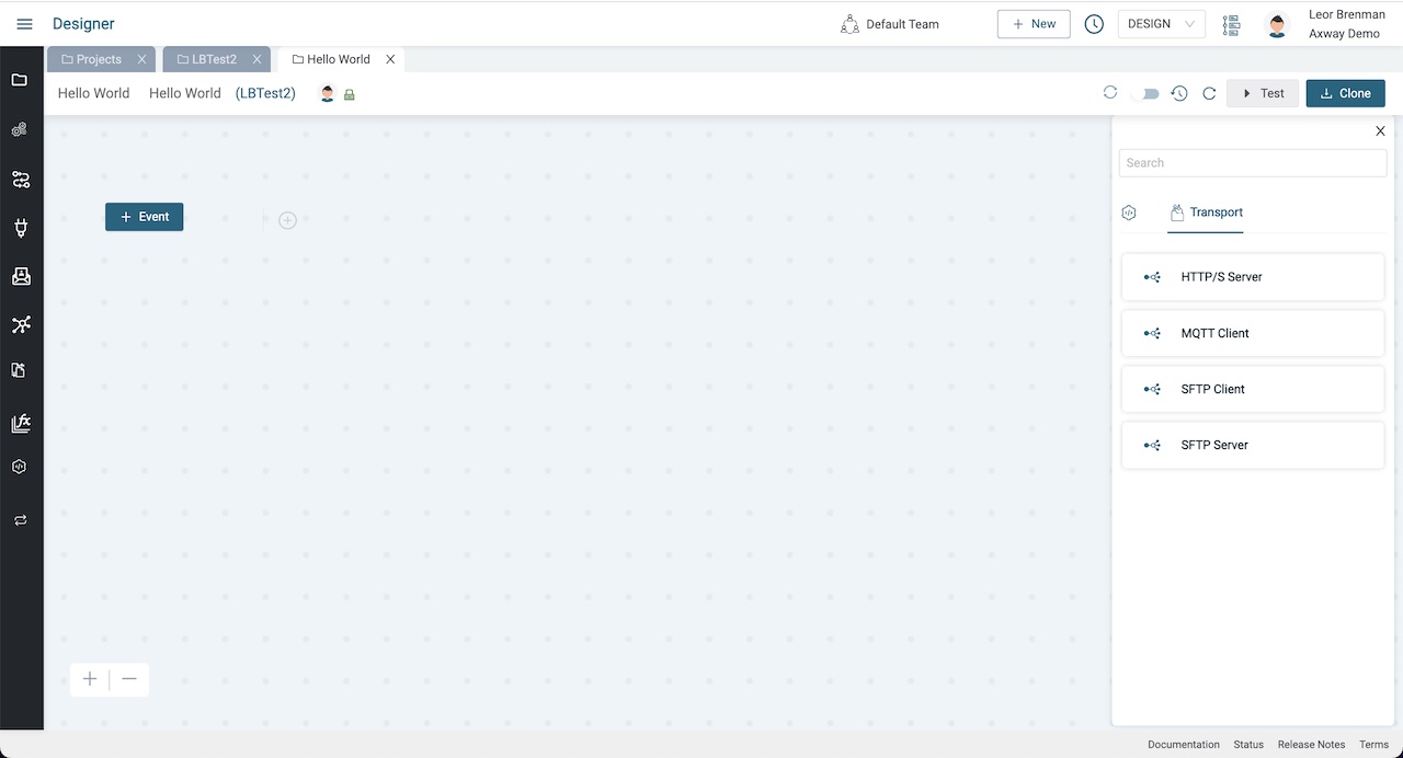
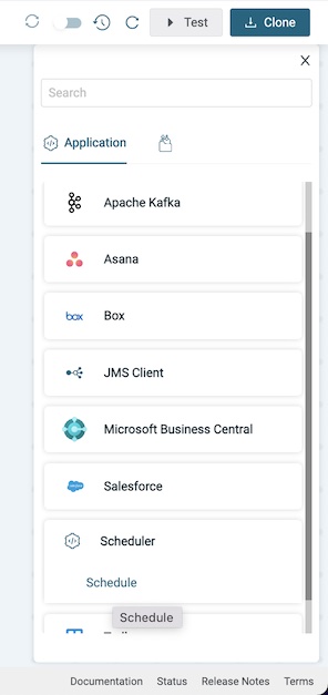
All integrations start with an event as shown on the left side of the canvas. Clicking on the Event button will display all the ways that you can trigger your integration.
Select Scheduler which is used to trigger your integration based on time intervals using a cron expression. It is also the only event trigger where you can also use the Test button to trigger your integration. This is useful in debug and development.
Enter 60 and press Save.
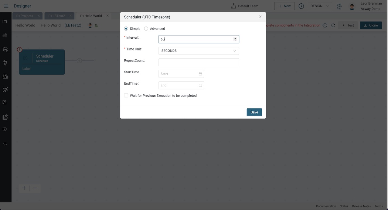
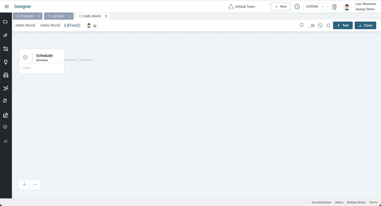
If we enabled our integration, it will fire every 60 seconds.
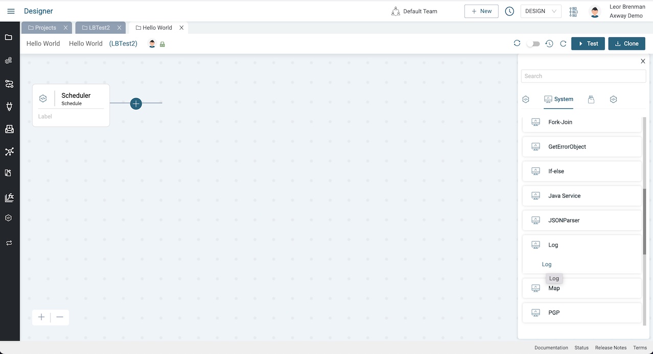
Add a component
Click the plus icon to the right of the Scheduler event trigger to add the next component that will run after the integration is triggered and select the Log component.
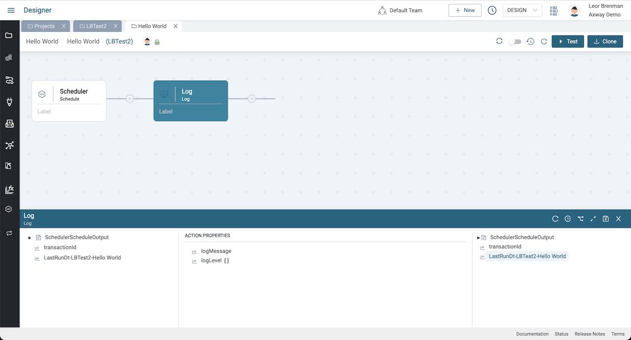
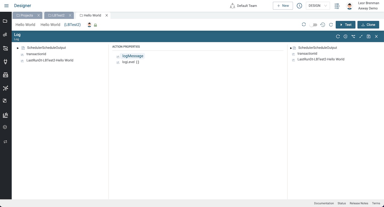
Expand the configuration panel at the bottom by clicking on the expand/collapse button.
Configure the component
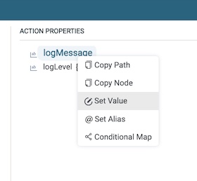
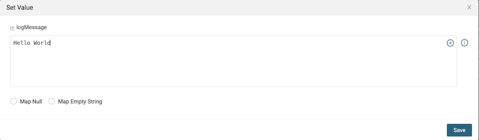
Right click on LogMessage Action Property and select SetValue and enter the text: Hello World, and click Save and then collapse the bottom panel.
Click the Save button.
Test the integration
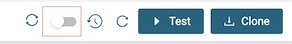
We could test the integration by enabling the event using the toggle button and waiting for the scheduler to trigger.
However, since our integration is triggered by a Scheduler event, we can use the Test feature.
Click the Test button to trigger the integration.
This will launch a new browser tab for the Monitor module and show the transaction for our triggered integration.
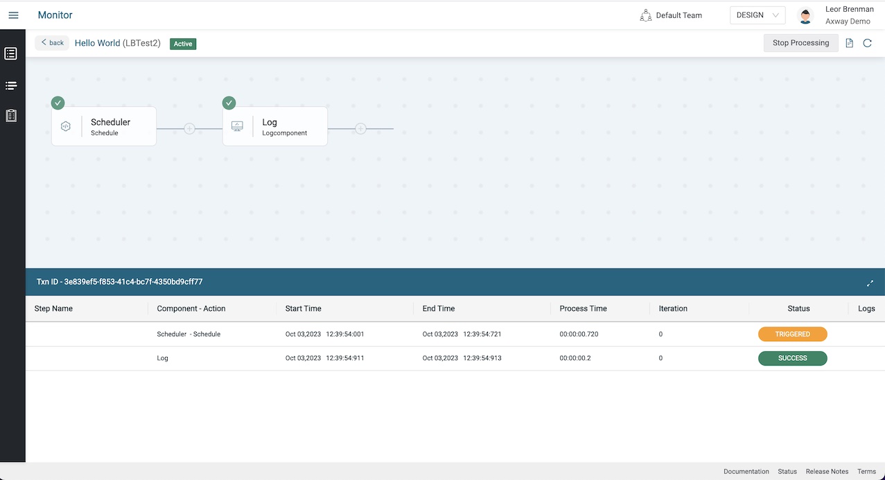
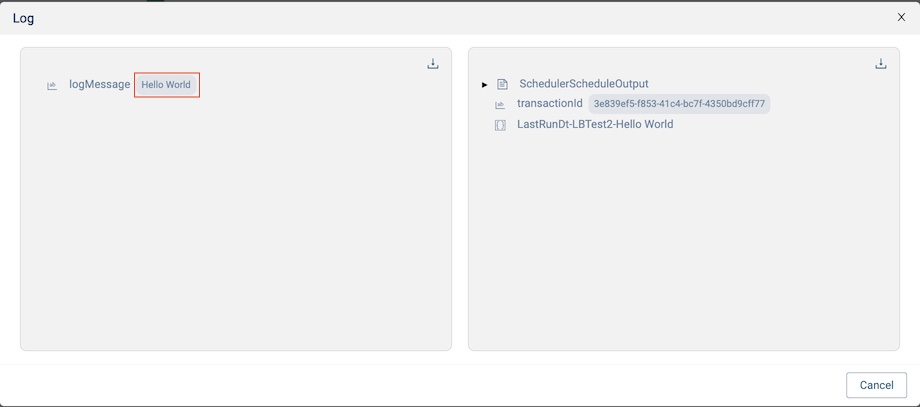
Click on the Log line in the transaction to see the details of this component’s execution and see the Hello World message.
Summary
In this blog post we were introduced to the Designer module of Amplify Fusion where integration developers spend most of their time. We created a project and an integration with a Scheduler and a Log component and tested the integration. We reviewed the integration execution in the Monitor module and viewed the transaction details.
In future blog posts, we’ll build on our knowledge and explore more of the features of Amplify Fusion to create no code integrations.
Dive deeper into what’s possible with Amplify Fusion.