As part of the ongoing efforts to improve user experience on the AMPLIFY Platform, I am happy to announce a major uplift that was rolled out to production last week (the release notes list all the new features and improvements). The new design and navigational patterns will help users access the most frequently used sections of the platform in less than 3-clicks.
Here are some of the key highlights of the AMPLIFY Platform UX Updates.
Navigate the platform faster
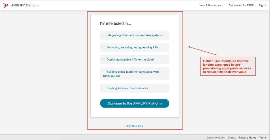
We have incorporated an optional view as part of the org activation flow that captures what area(s) of the AMPLIFY Platform the user is interested in. Based on the response(s), we now pre-provision the appropriate services before you land on the platform so that you can get on with your intended use cases quickly.

Improved Unified Navigation
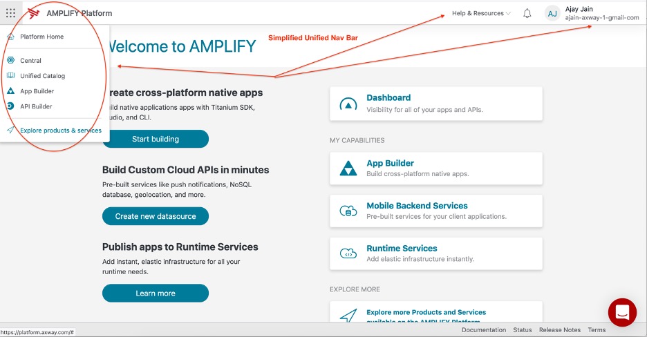
With the latest release, the unified navigation bar has a modern and simplified look and feel that allows users to get to where they need to go without much cognitive overload.

Streamlined Landing Page Experience
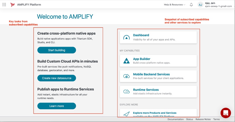
We have replaced the tile (Service & Offerings, My Capabilities) based landing page experience with a more streamlined view that clearly lays out the current capabilities being subscribed to and a list of key tasks mapped to these capabilities that act as deep links into various platform services. This is our first attempt at outlining the key tasks we think users would want to accomplish when they are on the platform and we will fine-tune this list as we gather user feedback and usage data. In subsequent releases, we will:
- Allow users to customize/adjust the displayed tasks based on their personal preferences (hide, favorite, reorder)
- Customize the list of tasks based on specified intent(s)

Simplified Org and User Views
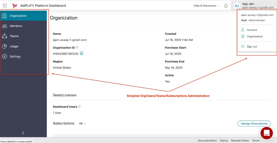
While the Org and User Management views have largely remained the same, we have reorganized the content so that an admin can find user/team/subscriptions/usage related views via a primary left nav menu as opposed to having to go back to the unified nav bar.

What Lies Ahead
This is only a first step towards larger improvements currently being discussed to improve the overall AMPLIFY Platform user experience that will be delivered in short order. Some of the upcoming changes include:
- Smart guided tours to announce updates to the platform and provide in-app contextual help
- Improved navigation flow when a user signs up on the platform while trying to access another portal (Support, Axway University, etc.)
As always, I welcome any constructive feedback on further improving the AMPLIFY Platform UX. You can always reach me at ajain@axway.com or use the Intercom chat button on the platform.
Learn about the AMPLIFY Platform’s Unified Catalog and API Portal

